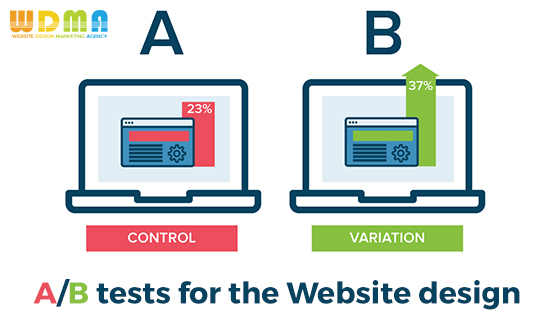
Why it is essential to run A/B tests for the homepage of your site
If you have a website, you need to start considering your homepage the most important part of it. This is the first thing visitors see when accessing your website, being your first chance to impress them and convince them that they have come to the right place. How to make sure that your homepage is optimized in the best way possible? Do know that you can check and optimize every little element on your homepage with the help of A/B tests. If you don’t know how to unroll them, you can easily ask the help of a reliable web development company to perform this task for you.
- Begin the tests from the top
What is the first thing visitors see when accessing your website’s homepage? We are talking about the header of the homepage, the place where your logo is placed and the part where the search bar is located. Believe it or not, but running A/B tests to see how your logo will look in different parts of the header will give you a wider perspective when it comes to making this part of your homepage more presentable. You should also do not miss the chance to test your search bar as well, to make sure that everything runs smoothly. And, do consider adding some language to your search bar, to make it more inviting. Play with various languages during testing and see which one captures the attention of visitors best.
- Check the Above the Fold content
Before we start talking about this part, you should know that the Above the Fold content is that part of your homepage that can be seen by your visitors without using the scroll at all. Practically, it is your first real opportunity to grab some attention and make people spend more time on your site. The A/B tests will help you see what option will work best in this particular section in order to engage your visitors more. You may want to talk about responsive website design with the web development company you are about to hire for this job, to make sure that regardless of content, your visitors will enjoy top notch design and navigation.
- But also go Below the Fold
We talked about Above the Fold, so now let’s go below it, by using the scroll to see what else lies on the page. You should encourage visitors to reach this section by allowing only the top of the info boxes available below to be seen from above, without scrolling down. So, make them curious to discover your homepage even more. Once they reach the below section, use image and text alternation to keep both the visitor’s mind and eyesight hooked in. Whatever you do, do not consider this part as being not interesting, because as long as you work hard enough to keep it interesting, everybody will want to scroll down and see what more you have to offer.
- The footer should also be included
Last, but not least, do make sure to include the footer in the A/B testing as well. The footer should include all kinds of information about your company and adopted policies, such as contact information, social links, newsletter, shipping policy, and so on. Also, do not forget about a call to action in order to see what attracts the attention of your visitors in the best manner. If you are interested in building a WordPress website or you just need an easy to work with and versatile platform, do take into consideration WordPress website development, because you will definitely not feel sorry for making such a choice.


